5 Smart Website Design Tricks to Enhance User Experience
Website design plays a pivotal role in how users perceive, interact with, and return to a site. An effective website not only looks appealing but also functions seamlessly, guiding users intuitively and ensuring their needs are met promptly. Smart design tricks—ranging from subtle layout changes to advanced usability enhancements—can dramatically improve both the functionality and visual appeal of a site. In this article, discover 5 Smart Website Design Tricks to Enhance User Experience and learn how to transform your site into a user-friendly powerhouse that stands out in 2025 and beyond.
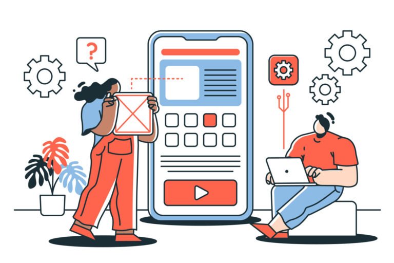
UX Design: The Foundation of Great Websites
What is UX Design and Why Is It Critical?
User Experience (UX) design is the practice of designing websites that are easy, efficient, and pleasant for users to interact with. A strong UX design focuses on understanding user needs, simplifying navigation, and ensuring every interaction feels natural and satisfying. Good UX is essential because it not only increases user satisfaction and engagement but also drives conversions and loyalty.
Think of UX as the invisible architecture that shapes how people feel when visiting your website. When done right, users won’t even notice it—they’ll simply enjoy a smooth, frustration-free experience that keeps them coming back.
Strategies & Tricks for Effective UX Design:
-
Simplify interfaces: Keep your website clean and uncluttered by only including essential elements. Every additional button, image, or piece of text should serve a purpose—if it doesn’t, it’s just creating visual noise.
-
Create intuitive navigation: Users should never have to think about how to move through your site. Clear navigation menus with logical organization help visitors find what they need without hunting around.
-
Establish visual hierarchies: Use size, color, and spacing strategically to guide attention to the most important elements first. Your primary call-to-action should stand out visually from secondary elements.
-
Implement accessibility features: Make your website usable for everyone by including proper contrast ratios, alt tags for images, and keyboard navigation options. Accessibility isn’t just good ethics—it’s good business.
-
Maintain consistency: Use uniform layouts, color schemes, and typography across all pages to create a cohesive experience that feels professional and trustworthy.
-
Gather and apply user feedback: Regularly collect insights from actual users to identify pain points and areas for improvement. User testing reveals issues that even experienced designers might miss.
One company that masterfully applied these UX principles is Airbnb. By simplifying their search process, implementing intuitive filters, and creating a consistent visual language throughout their platform, they transformed a clunky booking experience into one that feels almost effortless. The result? Higher conversion rates and increased user satisfaction.
Responsive Design: Adapting to Every Screen
What Is Responsive Design and Why Is It Important?
Responsive design ensures that a website displays and functions properly across all devices and screen sizes, from desktops to tablets and smartphones. With mobile devices now accounting for over 54% of global web traffic, implementing responsive design isn’t optional—it’s essential for survival in today’s digital landscape.
When users access a non-responsive site on mobile devices, they typically encounter tiny text, horizontal scrolling, and buttons too small to tap accurately. These frustrations lead directly to high bounce rates and lost opportunities.
Tricks for Achieving Responsiveness:
-
Use fluid grids and flexible layouts: Implement CSS that adjusts automatically to different screen resolutions and orientations. This ensures content reflows naturally whether viewed on a 27-inch monitor or a 5-inch smartphone screen.
-
Adopt a mobile-first approach: Start by designing for the smallest screen first, then progressively enhance the experience for larger devices. This forces you to prioritize the most essential content and functionality.
-
Implement flexible images: Use CSS techniques like
max-width: 100%to ensure images scale properly without breaking layouts or creating horizontal scroll bars on small screens. -
Optimize touch targets: Make interactive elements like buttons and links at least 44×44 pixels on mobile to accommodate the average fingertip size and prevent frustrating tap errors.
-
Test across multiple devices: Regularly check your website on various real devices—not just in browser simulators—to catch responsive design issues before your users do.
-
Consider breakpoints carefully: Rather than using standard breakpoints, analyze your specific content to determine where layouts need to shift for optimal viewing.
A standout example of responsive design is the mobile-friendly website approach detailed by RamrasTech, which shows how optimized responsive design can dramatically increase engagement metrics and reduce bounce rates across devices.
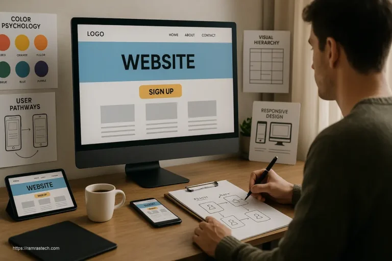
Strategic Web Layout: Guiding the User Journey
Why Web Layout Matters
A well-structured web layout provides visual clarity, guides users’ eyes to key content, and makes navigation seamless. Your website’s layout isn’t just about aesthetics—it’s a strategic tool that influences how users interact with your content and ultimately affects conversion rates.
Thinking of your layout as a visual roadmap helps clarify its importance. Just as a poorly designed road system causes traffic jams and confusion, a chaotic website layout creates frustration and abandonment.
Popular Layout Structures and Optimization Tricks:
-
Implement deliberate visual hierarchies: Use size, color, contrast, and whitespace to create a clear visual path that guides users from the most important elements to secondary content.
-
Utilize the F-pattern for text-heavy pages: Research shows users typically scan content in an F-shaped pattern (across the top, down a bit, across again, then down the left side). Position critical content along this natural scanning pattern.
-
Apply the Z-pattern for simpler pages: For pages with less content, the Z-pattern (top left to right, diagonally down to the bottom left, then across to bottom right) effectively guides users through key information and toward a call to action.
-
Embrace strategic whitespace: Don’t fear empty space—it’s essential for creating visual breathing room that helps users process information without feeling overwhelmed. Proper whitespace can increase comprehension by up to 20%.
-
Create content chunks: Break information into digestible sections with clear headings and consistent spacing to improve readability and retention.
-
Position CTAs at natural decision points: Place call-to-action buttons where users are most likely to have received enough information to make a decision—often after benefit statements or problem-solution presentations.
The financial platform Mint exemplifies smart layout principles by guiding users through a complex topic (personal finance) with a clean, hierarchical layout that naturally leads to key actions without overwhelming visitors.
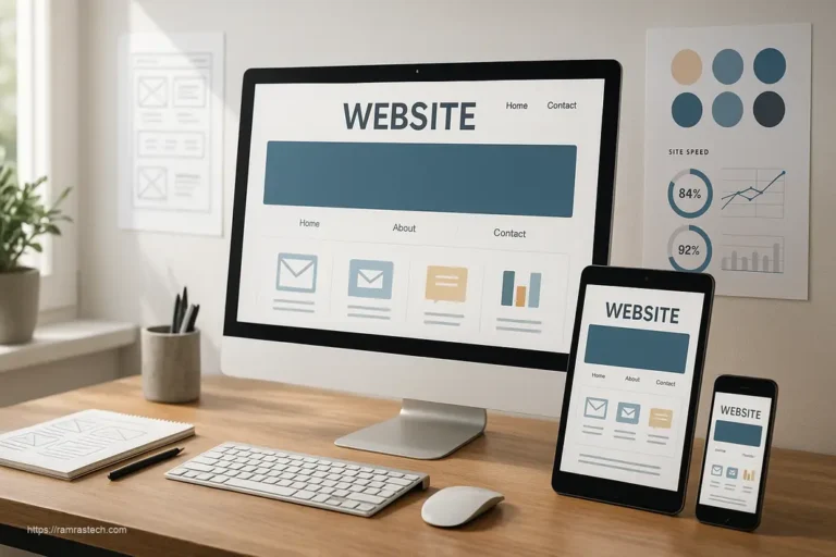
Speed Optimization: The Hidden Conversion Killer
Impact of Website Speed
Website speed directly affects user experience and site rankings. According to Google, 53% of mobile users abandon sites that take longer than three seconds to load. Each additional second of load time increases bounce rates by an average of 32% and decreases conversions by roughly 7%.
Speed isn’t just a technical concern—it’s a major business factor that directly impacts your bottom line. Even the most beautiful, feature-rich website will fail if users don’t stick around long enough to see it.
Common Issues and Smart Speed Tricks:
-
Compress and optimize images: Use modern formats like WebP that provide superior compression without quality loss, and implement lazy loading so images only download when they’re about to enter the viewport.
-
Minify and combine code files: Remove unnecessary characters, whitespace, and comments from your HTML, CSS, and JavaScript files, then combine multiple files where possible to reduce HTTP requests.
-
Leverage browser caching: Set appropriate cache headers so returning visitors don’t need to download unchanged assets again, dramatically improving their experience on subsequent visits.
-
Implement Critical CSS: Identify and inline the CSS needed for above-the-fold content to render quickly, allowing the page to display visually complete while the rest of the assets load.
-
Use Content Delivery Networks (CDNs): Distribute your static assets across global servers to reduce physical distance between users and your content, resulting in faster load times worldwide.
-
Optimize web fonts: Limit the number of font variations and use the
font-display: swapproperty to ensure text remains visible during font loading. -
Reduce third-party scripts: Each external script adds loading time and creates potential failure points. Audit all third-party code and remove anything that doesn’t provide sufficient value.
Shopify’s platform demonstrates impressive speed optimization, maintaining fast load times despite complex e-commerce functionality. By aggressively caching resources and prioritizing above-the-fold content rendering, they’ve created shopping experiences that feel instantaneous.
SEO-friendly web design principles should be integrated with speed optimization techniques to maximize both user experience and search visibility.
User Interface (UI): Where Art Meets Functionality
What Is UI and Its Connection to UX?
The user interface (UI) encompasses all the visual and interactive elements users engage with on a site, including buttons, menus, forms, icons, and typography. While UX is about the overall feeling and effectiveness of the experience, UI is the tangible, visible layer through which that experience is delivered.
Think of UI as the digital equivalent of a physical storefront—it’s what creates the first impression and continues to shape perceptions throughout the user journey. Great UI design feels both aesthetically pleasing and invisible, allowing users to accomplish tasks without noticing the interface itself.
UI Design Tricks for Cohesion and Appeal:
-
Create a consistent color system: Develop a primary, secondary, and accent color palette with specific usage rules for different UI elements. This consistency builds visual stability while allowing for creative expression.
-
Implement meaningful animations: Use subtle motion to provide feedback, guide attention, and create delight—but keep animations purposeful and performance-friendly. Motion should clarify relationships between elements, not distract from content.
-
Design for scanning: Most users scan rather than read webpage content. Use strategic bolding, bullet points, and varying text sizes to help scanners quickly extract key information.
-
Balance text and visuals: Find the right mix of written content and visual elements based on your audience’s preferences and your content’s purpose. Too much of either can diminish effectiveness.
-
Create clear states for interactive elements: Design distinct visual states for normal, hover, active, and disabled conditions of interactive elements to provide clear feedback about what’s clickable and what’s happening.
-
Use familiar patterns when possible: Leverage common design patterns for navigation, forms, and other standard components so users don’t have to learn new interaction models. Innovation should focus on your unique value proposition, not reinventing navigation.
-
Make accessibility beautiful: Design with accessibility in mind from the start by using sufficient color contrast, clear focus states, and proper heading structures. Accessible design often leads to better design for everyone.
The meditation app Headspace exemplifies excellent UI design with its clean, consistent visual language, clear interactive states, and thoughtful use of subtle animations that reinforce the calm experience they want users to have.
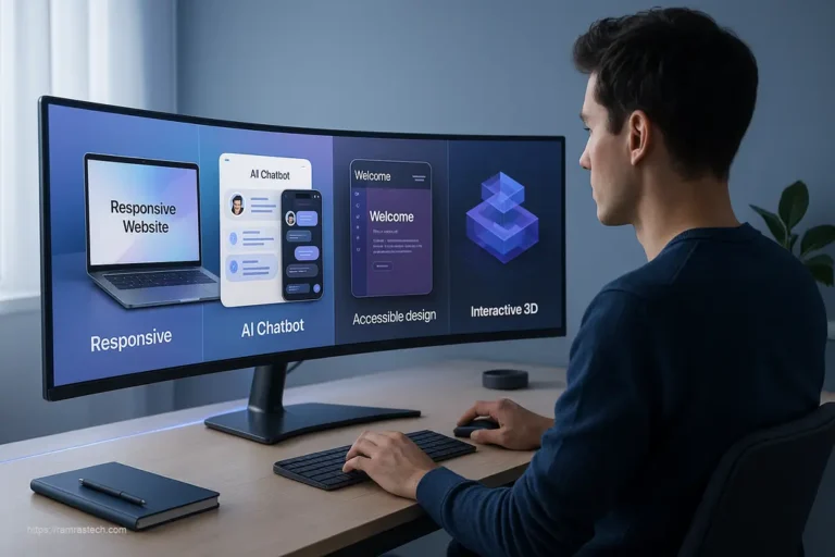
Advanced Website Design Tricks for 2025
Incorporating AI-Driven Personalization
As we move further into 2025, AI-powered personalization is becoming accessible to businesses of all sizes. Smart websites now adapt content, offers, and even layouts based on user behavior patterns, location, device type, and previous interactions.
Implementing personalization doesn’t require an enterprise budget anymore. Start with:
- Dynamic content blocks that display different information based on user segments
- Behavioral-based navigation that highlights the paths most relevant to each user
- Personalized product recommendations that leverage browsing and purchase history
- Contextual CTAs that change based on the user’s stage in the customer journey
One of the most effective approaches is to combine explicit personalization (where users select preferences) with implicit personalization (based on observed behaviors). This creates experiences that feel helpful rather than creepy.
Micro-Interactions That Delight
Micro-interactions are small, subtle moments centered around completing a single task. They provide feedback, guide users, and add personality to your website. In 2025, these tiny details often make the difference between a forgettable site and a memorable one.
Effective micro-interactions include:
- Button animations that respond to hover and click events
- Progress indicators that show system status during processes
- Form field validations that provide immediate feedback
- Success states that celebrate completed actions
- Loading animations that reduce perceived wait time
The key to successful micro-interactions is subtlety—they should enhance the experience without calling too much attention to themselves or slowing down the interface.
Voice User Interface Integration
With voice search continuing its rapid growth, forward-thinking websites are incorporating voice user interface (VUI) elements that allow hands-free navigation and interaction. This especially benefits mobile users and improves accessibility for users with disabilities.
Consider implementing:
- Voice search capability within your site search function
- Voice navigation options for hands-free browsing
- Voice-activated forms that simplify data entry
- Audio feedback that confirms voice commands
Ensure your voice interface uses natural language processing that understands conversational queries rather than requiring exact keyword matches.
Measuring Design Effectiveness
Key Metrics for Website Design Success
How do you know if your website design tricks are actually working? Implement these measurement approaches to quantify design effectiveness:
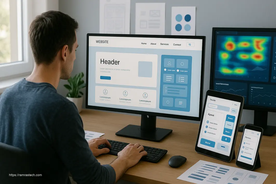
- Heat mapping tools that show where users are clicking, scrolling, and focusing attention
- User session recordings that reveal navigation patterns and potential friction points
- Conversion funnels that identify where users are dropping out of processes
- A/B testing of different design elements to determine which performs better
- User surveys and feedback that provide qualitative insights about the experience
Focus particularly on metrics that reveal user frustration, such as rage clicks (repeated rapid clicks in the same area), form abandonment rates, and exit percentage on key pages.
Implementing analytics in Google Analytics can provide rich insights into how design changes affect user behavior.
Common Website Design Mistakes to Avoid
Even with the best intentions, website designers often fall into common traps that undermine user experience. Be vigilant about avoiding these pitfalls:
-
Prioritizing aesthetics over function: Beautiful designs that frustrate users ultimately fail. Always test functionality with real users.
-
Ignoring mobile users: Not thoroughly testing on mobile devices or treating mobile as an afterthought creates poor experiences for the majority of web users.
-
Cluttered layouts: The desire to showcase everything important at once creates visual noise that makes nothing stand out.
-
Inconsistent navigation: Changing navigation patterns between pages confuses users and increases cognitive load.
-
Low contrast text: Gray text on light backgrounds might look elegant in design mockups but causes eye strain and accessibility issues in practice.
-
Auto-playing media: Videos or audio that play automatically often create jarring experiences that frustrate users, especially on mobile.
-
Generic stock photography: Overused stock photos feel inauthentic and can undermine trust in your brand. Invest in original photography or carefully selected authentic stock.
By being mindful of these common mistakes, you can ensure your website design efforts enhance rather than detract from the user experience.
FAQs About Website Design Tricks
How much should I budget for professional website design?
Professional website design costs vary widely depending on complexity, features, and the designer’s experience level. Simple business websites typically range from $2,000 to $8,000, while complex e-commerce sites or custom web applications can cost $10,000 to $50,000+. Many businesses find success with a hybrid approach—starting with a premium template ($50-200) and customizing it with professional help ($1,000-3,000).
How often should I update my website design?
Most businesses should evaluate their website design annually and implement major redesigns every 2-3 years. However, this timeline can vary based on your industry’s digital evolution pace, changes in user expectations, and your competition. Rather than following a strict calendar, watch for indicators like declining conversion rates, increasing bounce rates, or design elements that look dated compared to competitors.
Which website design elements have the biggest impact on conversions?
The highest-impact design elements for conversions typically include: clear, compelling call-to-action buttons; simplified navigation; fast load times; mobile optimization; social proof elements (reviews, testimonials); and streamlined forms. Focus on reducing friction in the user journey toward conversion actions rather than adding flashy features that might distract from your primary goals.
Do I need a custom website or will a template work?
This depends on your specific business needs. Templates work well for businesses with standard functionality requirements and budget constraints. They offer quick implementation and proven usability patterns. Custom designs become necessary when you have unique business processes, special functionality requirements, or need to differentiate significantly from competitors. Many successful websites start with templates and gradually implement custom elements as the business grows.
How can I make my website more accessible without sacrificing design quality?
Accessibility and great design are complementary, not contradictory. Implement sufficient color contrast while maintaining your brand palette by using darker shades of your colors for text. Ensure all interactive elements are keyboard-navigable and include proper focus states that look intentional. Add alt text to images that enhances rather than merely describes. Structure content with proper heading levels that create both visual hierarchy and screenreader compatibility. These practices often improve the experience for all users, not just those with disabilities.
Conclusion
To recap, enhancing user experience through smart website design isn’t just about aesthetics—it’s a strategic approach that combines simple interfaces, responsive functionality, well-structured layouts, rapid load times, and an intuitive, accessible user interface. Adopting these 5 Smart Website Design Tricks will help your site attract, engage, and satisfy users, ultimately boosting your brand’s credibility and performance.
The most successful websites in 2025 will be those that balance visual appeal with functionality, speed with feature richness, and innovation with usability. By applying the principles outlined in this article—from user-centric UX design to performance optimization and thoughtful UI elements—you can create a website that not only looks impressive but actually delivers business results.
Remember that great website design is never truly finished. The digital landscape continues evolving, and user expectations shift accordingly. Commit to ongoing testing, learning, and refinement to ensure your website remains effective.
What’s Your Next Design Move?
What website design trick will you implement first? Have you found certain approaches particularly effective for your audience? Share your thoughts or questions in the comments below!
For more insights on creating effective digital experiences, check out our guide on digital marketing strategies that complement great website design.