7 Cutting-Edge Website Design Hacks to Improve User Experience
Website design serves as the digital storefront for your brand, directly impacting how users perceive your business and whether they stay engaged or click away. In an increasingly competitive digital landscape, mastering website design hacks has become essential for creating experiences that not only look appealing but also function seamlessly across all platforms. This comprehensive guide will walk you through proven strategies that can transform your website into a user-friendly, high-performing asset that drives engagement and conversions.
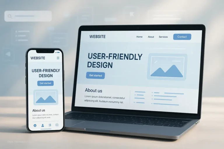
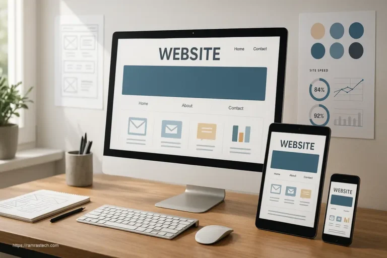
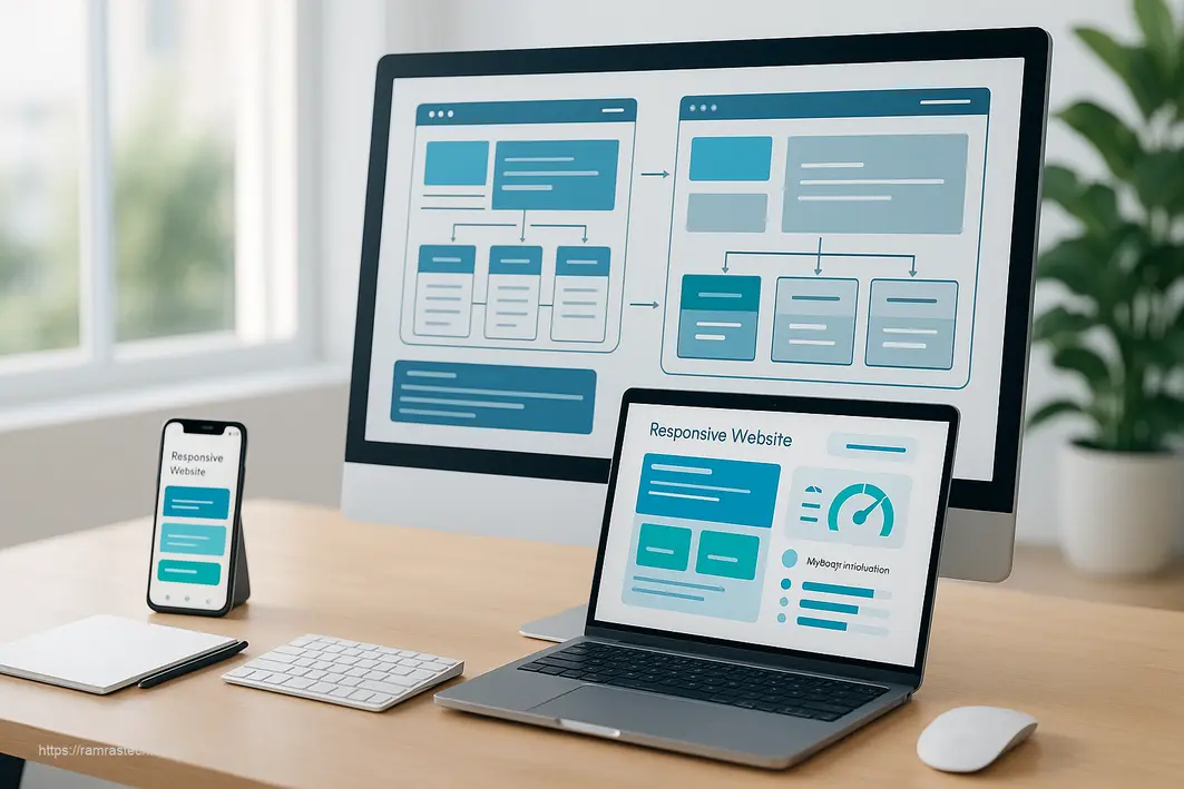
1. Embrace Responsive Design
Responsive design is the foundation of modern web development, ensuring your website automatically adapts to any screen size—from desktop monitors to smartphones and tablets. This approach is no longer optional; it’s essential for success in 2025.
Why Responsive Design Matters
With mobile devices accounting for an increasingly significant portion of web traffic, responsive design directly impacts your ability to reach and retain users. A website that functions poorly on mobile devices creates frustration, leading visitors to abandon your site for competitors. Responsive design ensures consistent functionality and visual appeal regardless of the device being used.
Key Benefits
- Improved user experience across devices: Users enjoy a seamless browsing experience whether they’re on a laptop or smartphone
- Better SEO performance: Search engines prioritize mobile-friendly websites in their rankings
- Reduced maintenance: A single responsive site is easier to maintain than separate desktop and mobile versions
- Increased mobile usability: Touch-friendly interfaces and appropriately sized elements make navigation intuitive on smaller screens
Implementation Tools and Frameworks
Leverage lightweight libraries and frameworks specifically designed for responsive development rather than bloated solutions that slow down your site. Modern platforms like WordPress and Wix offer built-in responsive capabilities, while custom coding approaches can use CSS media queries and flexible grid systems.
2. Prioritize Speed Optimization
Website loading speed is a critical factor in user retention and search engine optimization. Studies consistently show that users abandon websites that take more than a few seconds to load, making speed optimization a crucial website design hack.
The Performance Impact
Speed affects both user experience and business outcomes. Slow-loading sites frustrate visitors, increase bounce rates, and negatively impact your SEO rankings. Conversely, optimized websites provide better user satisfaction and improved conversion rates.
Essential Speed Optimization Techniques
Implement these proven methods to dramatically improve your website’s loading performance:
- Image compression: Reduce file sizes without sacrificing quality using modern image formats and compression tools
- Minimize HTTP requests: Combine files and reduce the number of resources the browser must load
- Browser caching: Enable visitors’ browsers to store static assets locally, dramatically reducing load times on repeat visits
- Reduce scripts and bloat: Use lightweight libraries instead of heavy frameworks; avoid unnecessary plugins
- Lazy loading: Load images and content only when users scroll near them
Assessment and Monitoring
Tools like Google PageSpeed Insights, GTmetrix, and WebPageTest provide detailed performance metrics and actionable recommendations. Regular monitoring ensures your site maintains optimal speed as you add new content and features.
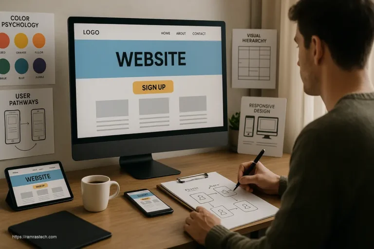
3. Implement Effective Visual Hierarchies
Visual hierarchy is the strategic arrangement of design elements to guide users’ attention and establish a clear order of importance. By controlling size, color, contrast, and spacing, you direct visitors toward your most important content and calls-to-action.
Understanding Visual Hierarchy
When implemented effectively, visual hierarchy prevents users from feeling overwhelmed by information. Instead of presenting all content with equal emphasis, you create a visual “roadmap” that makes navigation intuitive and content consumption effortless.
Design Principles for Strong Hierarchy
- Size contrast: Use dramatically oversized typography to anchor attention on primary elements, while smaller text invites detailed engagement
- Color contrast: Apply bold, contrasting colors to highlight important elements against neutral backgrounds
- Font variations: Different typefaces, weights, and styles naturally draw focus to key information
- Strategic spacing: Use white space to separate elements and create visual breathing room
- Balance confidence and subtlety: Let bold, dominant elements make strong statements while delicate details add nuance
Well-executed visual hierarchies guide users effortlessly through your website, improving comprehension and encouraging desired actions like sign-ups or purchases.
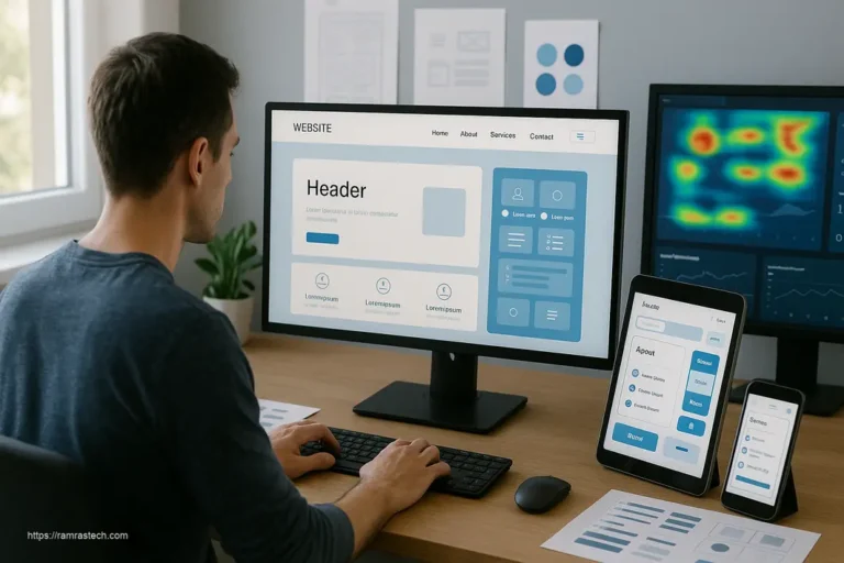
4. Enhance User Interfaces
A user interface (UI) encompasses all visual and interactive elements users encounter when navigating your website. Superior UI design transforms potential confusion into delight, making the difference between a visitor who converts and one who leaves.
Core Principles of Effective UI Design
Consistency maintains uniform layout, color schemes, and typography across all pages, creating a cohesive and professional experience. When users know what to expect, they navigate more confidently and form positive associations with your brand.
Intuitive navigation allows visitors to find what they need without confusion. Include clear, simple navigation near the top of the page, use breadcrumbs to help users trace their steps, and incorporate a search bar for keyword searches.
Feedback and responsiveness confirm user actions through visual cues—button states that change on hover, loading indicators that show progress, and success messages that acknowledge completed actions. These micro-interactions make interfaces feel responsive and alive.
Simplicity and clarity ensure every design element serves a purpose. Avoid unnecessary features that add visual clutter, and prioritize essential functionality that supports your primary goals.
Best Practices for Engagement
Combining these principles creates interfaces that don’t just function well but actively enhance user satisfaction. Include visually striking calls-to-action (CTAs) like “Get a Quote” or “Sign Up Now” that clearly guide visitors toward the next step. Interactive elements such as hover effects and animations should enhance the experience without overwhelming users.
Want to see these principles in action? Check out our guide on smart website design tricks that enhance user experience.
5. Ensure Mobile Accessibility
Mobile accessibility has evolved beyond simply fitting your design onto smaller screens. It now encompasses creating genuinely usable experiences for the millions of people accessing websites primarily through mobile devices.
The Mobile-First Imperative
Mobile users represent a substantial and growing portion of web traffic. Designing with mobile-first principles means creating the optimal mobile experience first, then enhancing it for larger screens. This approach ensures nobody is left behind regardless of their device choice.
Strategies for Mobile Optimization
- Touch-friendly navigation: Ensure buttons and clickable elements are large enough for comfortable finger interaction
- Simplified layouts: Streamline content for smaller screens, prioritizing the most important information
- Fast loading on mobile networks: Optimize aggressively for mobile users who may have slower connections
- Avoid problematic technologies: Don’t rely on Flash, complex scripts, or hover-only navigation that don’t work well on mobile devices
Accessibility and Inclusivity
Accessible design benefits all users, not just those with disabilities. Follow Web Content Accessibility Guidelines (WCAG) standards to ensure your site is usable by everyone, including those using screen readers, keyboard navigation, or other assistive technologies. This commitment to accessibility also improves your SEO and expands your potential audience.
For a deeper dive into mobile optimization, explore our article on essential strategies for mobile-friendly website design.
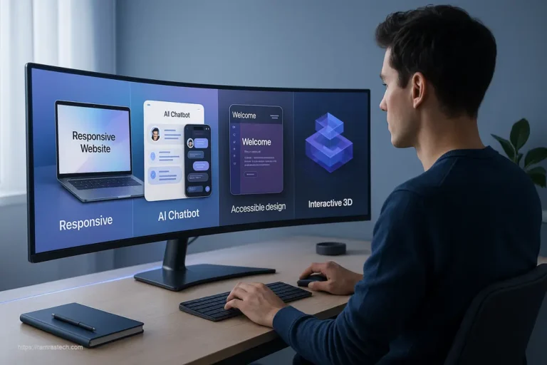
6. Harness Cutting-Edge Design Trends for Enhanced Engagement
Beyond foundational best practices, 2025 website design introduces exciting trends that can significantly boost engagement when implemented thoughtfully.
Interactive and Immersive Experiences
Micro-animations—subtle interactions like button ripples, hover effects, and loading indicators—add polish and guide users through your interface. Scroll-triggered animations transform static content into dynamic experiences, with elements zooming, sliding, or fading in as users scroll through your page. These techniques maintain engagement without overwhelming visitors.
Bold Visual Design
Incorporate contrasting color palettes with neon accents and high-impact typography to create memorable designs that stand out. Three-dimensional elements, from sculptural typography to interactive 3D objects users can manipulate, create a sense of depth and immersion. Whether you embrace full-screen headers for visual impact or nostalgic design elements refined for modern contexts, these trends add personality while maintaining functionality.
Modern Content Approaches
Custom illustrations give your site instant personality and differentiate it from competitors. Text-only layouts return for writers, developers, and minimalist blogs, offering super-fast loading and uncluttered reading experiences. Blending photography with graphical overlays like doodles and collage elements adds context and creativity.
The key is implementing these trends purposefully—they should enhance your user experience and align with your brand identity, not merely chase trends for their own sake.
Stay ahead of the curve by exploring our guide to revolutionary web design trends enhancing UX.
7. Optimize for Search Engine Success
Even the most beautiful website design falls short if users can’t find it. Integrating SEO principles into your design process ensures your site ranks well in search results while still delivering exceptional user experiences.
SEO-Friendly Website Design Elements
- Clean, logical HTML structure: Use proper heading tags (H1, H2, H3) in a hierarchical manner that helps search engines understand your content organization
- Fast loading times: Site speed is both a UX and SEO factor, with Google explicitly favoring faster websites
- Mobile optimization: Google’s mobile-first indexing means your mobile experience directly impacts rankings
- Semantic markup: Implementing schema.org markup helps search engines better understand your content
- URL structure: Create clean, descriptive URLs that include relevant keywords where appropriate
Balancing Design and SEO
The good news? Today’s best design practices align perfectly with SEO requirements. Gone are the days when optimizing for search meant sacrificing visual appeal or functionality. Modern website design hacks should enhance both the user experience and search visibility simultaneously.
Learn more about this symbiotic relationship in our article on SEO-friendly web design services.
8. Integrate Strategic Conversion Elements
Great website design isn’t just about aesthetics—it’s about achieving business goals. Strategic design elements can significantly impact conversion rates and lead generation without appearing pushy or salesy.
Conversion-Focused Design Techniques
- Strategic call-to-action (CTA) placement: Position CTAs at natural decision points throughout user journeys, not just at the bottom of pages
- Attention-guiding visual cues: Use directional elements like arrows or people looking toward important content to naturally direct user attention
- Social proof integration: Strategically place testimonials, reviews, and client logos near conversion points to build trust
- Simplified forms: Reduce friction by requesting only essential information in forms and breaking longer forms into manageable steps
- Clear value propositions: Communicate benefits immediately and clearly, focusing on how your offering solves specific user problems
Testing and Optimization
Implement A/B testing to refine your conversion elements over time. Small changes to button colors, headline phrasing, or form layouts can dramatically impact conversion rates. Tools like Google Optimize make testing accessible even for small businesses without dedicated development teams.
9. Frequently Asked Questions About Website Design Hacks
How much does it cost to implement responsive design on an existing website?
The cost of implementing responsive design varies widely depending on your current website’s complexity. Simple WordPress sites might require $1,000-$3,000 for a responsive theme and customization, while complex e-commerce platforms could cost $5,000-$20,000 for a comprehensive responsive redesign. Many businesses find the investment pays for itself through improved mobile conversions and reduced bounce rates.
What’s the ideal website loading time for optimal user experience?
Research consistently shows that websites should load in under 2-3 seconds to prevent abandonment. Google recommends aiming for under 1.5 seconds for optimal user experience and SEO performance. Each additional second of loading time correlates with approximately a 7% reduction in conversions, making speed optimization one of the most impactful website design hacks.
Is using templates bad for website design?
Templates aren’t inherently good or bad—their effectiveness depends on how they’re implemented. Quality templates from reputable providers offer solid foundations that can be customized to align with your brand. What matters most is whether the template supports your specific goals, loads quickly, and provides a positive user experience. Many successful businesses use customized templates rather than completely custom designs.
How often should I update my website design?
Most websites benefit from a major design update every 2-3 years, with minor improvements implemented continuously. Technology, user expectations, and design trends evolve rapidly, making regular updates necessary to stay competitive. However, focus on purpose-driven redesigns that enhance user experience rather than changing merely for the sake of novelty.
10. Conclusion
Mastering these website design hacks positions you to create digital experiences that attract, engage, and convert visitors. From responsive design that works across all devices to speed optimization that respects users’ time, these strategies address the fundamental needs of modern web users. By implementing effective visual hierarchies, enhancing your UI, prioritizing mobile accessibility, and thoughtfully incorporating contemporary design trends, you create websites that don’t just function—they delight.
The most successful websites share a common trait: they prioritize user experience above all else. Every design decision, from color choices to animation timing, should serve the goal of making visitors’ interactions effortless and enjoyable.
Looking to implement these strategies alongside a comprehensive marketing approach? Check out our guide on unbeatable digital marketing strategies that complement effective website design.
Ready to Transform Your Website?
These insights represent just the beginning of your journey toward web design excellence. Don’t let these proven strategies sit unused—start implementing them today. Begin with one or two hacks that address your most pressing challenges, then systematically improve other areas.
We’d love to hear from you: Have you implemented any of these website design hacks? Share your experiences and results in the comments below—what worked best for your site? Subscribe to our blog for regular updates on emerging web design trends, practical tutorials, and case studies that show real-world results. Your next breakthrough in user engagement could be just one blog post away.