The Ultimate Guide: Web Design Principles for Enhanced UX
Introduction
In today’s digital landscape, web design plays a pivotal role in shaping how people perceive and interact with online content. A well-designed website not only attracts visitors but also ensures they stay engaged, find what they need, and leave with a positive impression. Incorporating fundamental Web Design Principles is essential for enhancing user experience (UX), making digital platforms more appealing, accessible, and effective at fulfilling their intended purpose.
Think about the last time you visited a website and immediately clicked away. Was it because the site took forever to load? Maybe the colors hurt your eyes? Or perhaps you simply couldn’t figure out how to find what you were looking for? These frustrating experiences all stem from poor web design – and they’re entirely avoidable when you understand the core principles that guide effective web development.
What Are Web Design Principles and Why Do They Matter?
Web design principles are essentially the foundational guidelines that help designers create websites that aren’t just pretty, but functional and user-friendly too. They’re like the recipe for a successful website – skip an ingredient, and the whole thing might fall flat.
These principles didn’t just appear out of thin air. They’ve evolved over decades of design theory, usability testing, and user behavior analysis. What’s fascinating is how they blend artistic sensibility with practical psychology – creating interfaces that not only look good but also feel intuitive to use.
The importance of these principles can’t be overstated. According to research, users form an opinion about a website in a mere 0.05 seconds. That’s literally the blink of an eye! And about 38% of people will stop engaging with a website if the layout or content is unattractive. These statistics highlight why understanding and implementing proper web design principles isn’t just nice to have – it’s essential for online success.
The Core Web Design Principles Every Designer Should Master
Balance: Creating Visual Harmony
Balance in web design refers to the distribution of visual weight across your webpage. Just like a well-balanced meal nourishes your body properly, a well-balanced webpage nourishes the user’s eyes and makes information easier to digest.
There are three main types of balance:
- Symmetrical balance: Elements are mirrored on either side of a central axis, creating a sense of formality and stability
- Asymmetrical balance: Different elements with varying visual weights are arranged to create equilibrium without mirror-imaging
- Radial balance: Elements radiate from a central point, creating a circular or spiral effect
Well-balanced designs help users process information more efficiently. Take Apple’s website as an example – they masterfully employ asymmetrical balance, using whitespace and carefully positioned product images to create a sense of elegance and simplicity that guides the user’s eye exactly where they want it to go.
Contrast: Making Important Elements Stand Out
Contrast is what makes things pop on your page. It’s the difference between elements that creates visual interest and hierarchy. Without contrast, websites become flat, boring, and difficult to navigate.
Contrast can be created through:
- Color (dark vs. light)
- Size (large vs. small)
- Shape (angular vs. curved)
- Texture (smooth vs. rough)
- Type (serif vs. sans-serif)
Perhaps the most important use of contrast is for accessibility. Sufficient contrast between text and background colors ensures readability for all users, including those with visual impairments. The Web Content Accessibility Guidelines (WCAG) actually specify minimum contrast ratios that websites should meet to be considered accessible.
Look at how Spotify uses contrast in their interface – vibrant album artwork pops against their dark background, while important UI elements use high-contrast colors to ensure they’re easily identifiable.
Hierarchy: Guiding Users Through Content
Visual hierarchy determines the order in which users process information on your site. It’s like creating a roadmap for the user’s eyes, guiding them from the most important elements to the least.
Effective hierarchy employs several techniques:
- Size (larger elements grab attention first)
- Color and contrast (brighter, higher-contrast elements stand out)
- Positioning (elements higher on the page get noticed first)
- Spacing (isolated elements get more attention)
- Typography variations (bold, italic, etc.)
Think about news websites – headlines are large and bold, subheadings are smaller but still prominent, and body text is smallest. This isn’t random; it’s carefully designed hierarchy that helps readers quickly scan and decide what to read in depth.
Consistency: Building User Confidence
Consistency in web design creates familiarity and comfort. When elements behave predictably across your site, users don’t have to relearn how to navigate each page, which significantly reduces cognitive load.
Consistency should be maintained in:
- Visual elements: Colors, fonts, button styles, and spacing
- Functional elements: Navigation menus, search functionality, and interactive features
- Content elements: Tone of voice, formatting, and terminology
Inconsistency, on the other hand, can quickly erode user trust. Imagine clicking a blue button on one page that takes you to a contact form, then finding a similar blue button on another page that downloads a PDF without warning. Pretty frustrating, right?
Amazon demonstrates excellent consistency across their massive site. No matter which department you’re browsing, the navigation patterns, product layouts, and checkout process remain reassuringly familiar.
Whitespace: Letting Your Design Breathe
Also called negative space, whitespace refers to the empty areas between elements. Don’t make the mistake of thinking this space is wasted – it’s actually one of the most powerful tools in a designer’s arsenal!
Strategic use of whitespace:
- Improves readability and comprehension
- Creates focus on important elements
- Conveys a sense of elegance and sophistication
- Reduces cognitive overload
A study by Wichita State University found that proper use of whitespace between paragraphs and in the left and right margins increased comprehension by almost 20%. That’s a huge improvement just from letting your content breathe a little!
Google’s homepage is perhaps the most famous example of effective whitespace. Despite having the most powerful search technology in the world, they present it with abundant whitespace, focusing user attention exactly where they want it – on the search bar.
Alignment: Creating Order and Organization
Alignment refers to how text and graphical elements are positioned in relation to each other on the page. Strong alignment creates invisible lines that connect elements visually, resulting in a more cohesive, organized appearance.
You’ll typically work with:
- Left alignment (clean, organized, easy to read)
- Center alignment (formal, symmetrical, good for headlines)
- Right alignment (unusual, can create interesting asymmetry)
- Justified alignment (formal, maximizes space, but can create awkward word spacing)
Poor alignment is like having a crooked picture frame on your wall – it might seem minor, but it creates a subtle sense of disorder that registers subconsciously.
Unity: Creating a Cohesive Experience
Unity ensures all elements work together to communicate a single, unified message. It’s about making sure every aspect of your design – from colors and typography to images and copy – feels like it belongs together.
To achieve unity, designers use:
- Proximity: Grouping related items together
- Repetition: Reusing colors, shapes, textures, and other elements throughout the design
- Continuation: Creating visual flow from one element to another
When a website lacks unity, it feels disjointed and unprofessional. Users might even wonder if they’ve accidentally navigated to a different site.
Modern Web Design Principles for 2025
Mobile-First Design: Prioritizing the Smartphone Experience
With mobile traffic consistently exceeding desktop, designing for mobile first isn’t just a principle – it’s a necessity. Mobile-first design means starting your design process with the smartphone user in mind, then adapting and expanding for larger screens.
This approach forces designers to:
- Prioritize content ruthlessly
- Simplify navigation
- Focus on performance optimization
- Design for touch interactions
Google has been using mobile-friendliness as a ranking factor since 2015, and with their move to mobile-first indexing, sites that don’t perform well on mobile are at a significant disadvantage in search results.
Interested in more insights on mobile design? Check out 10 Essential Strategies for Mobile-Friendly Website Design That Boost User Experience.
Accessibility: Designing for Everyone
Accessibility in web design means creating websites that can be used by everyone, including people with disabilities. It’s not just a nice-to-have – in many countries, it’s increasingly becoming a legal requirement.
Key accessibility considerations include:
- Screen reader compatibility: Proper heading structure, image alt text, and ARIA labels
- Keyboard navigation: Ensuring all functionality is available without a mouse
- Color contrast: Maintaining sufficient contrast for text readability
- Flexible text: Allowing users to resize text without breaking layouts
Around 15% of the global population lives with some form of disability. That’s over a billion potential users who might be excluded by inaccessible design. Beyond the ethical imperative, accessible websites typically offer better user experiences for everyone.
Performance Optimization: Speed Matters
Website speed isn’t just a technical concern – it’s a fundamental design principle. Users expect sites to load quickly, and they’ll abandon those that don’t.
According to Google, the probability of bounce increases by 32% as page load time goes from 1 to 3 seconds. That’s a third of your visitors gone before your site even finishes loading!
Key performance principles include:
- Optimizing image sizes and formats
- Minimizing HTTP requests
- Leveraging browser caching
- Using content delivery networks (CDNs)
- Implementing lazy loading for images and videos
For businesses, this directly impacts the bottom line. Amazon famously discovered that each 100ms of added load time cost them 1% in sales. When you’re doing Amazon-level business, that’s a very expensive 100 milliseconds.
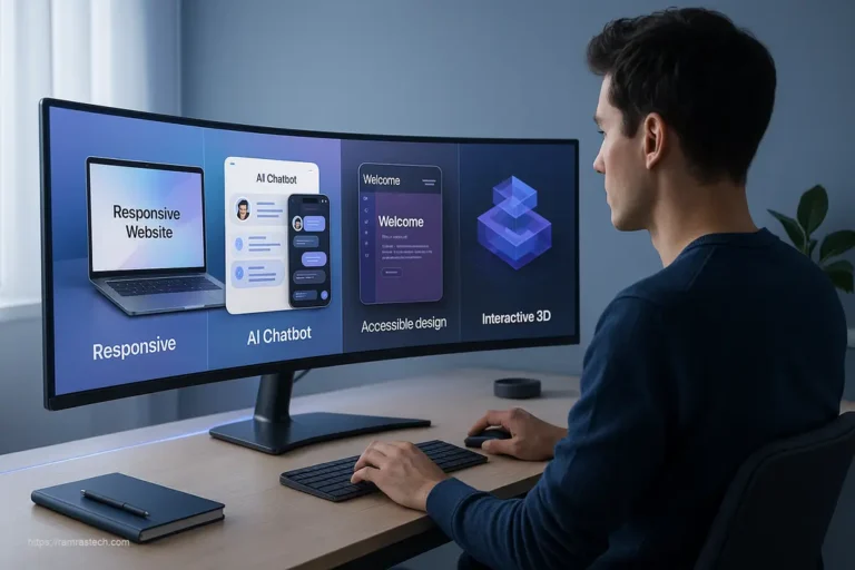
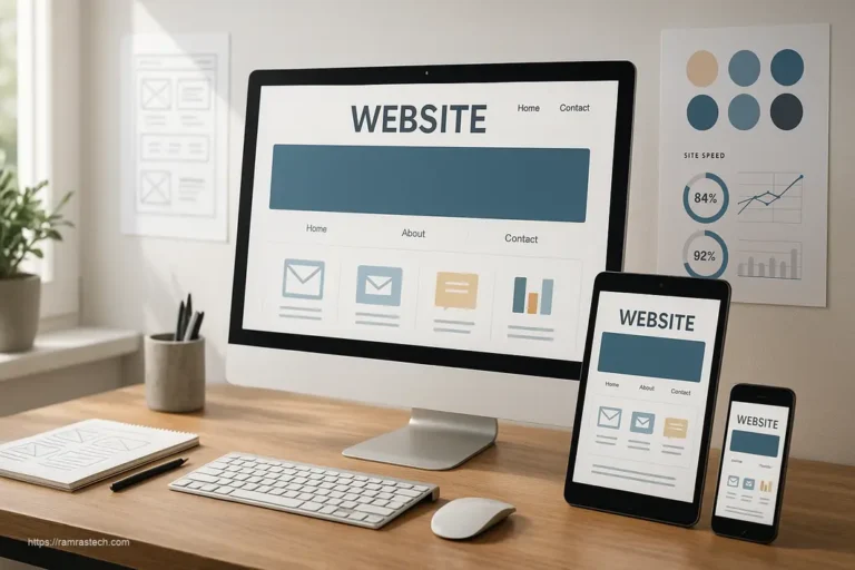
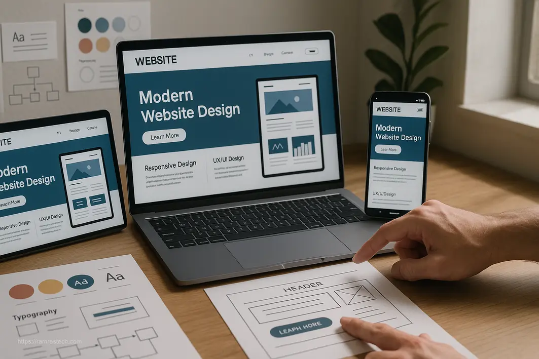
Responsive Design: Adapting to Any Device
Responsive design ensures your website looks and functions well on any device and screen size. It’s related to mobile-first design but extends beyond just mobile and desktop to include tablets, large monitors, and even non-traditional displays.
Core responsive design techniques include:
- Fluid grid layouts that use relative units like percentages
- Flexible images that scale within their containing elements
- Media queries that apply different styles based on device characteristics
With the proliferation of devices continuing to grow – from foldable phones to ultra-wide monitors – responsive design isn’t just about accommodating current devices but preparing for whatever comes next.
How These Principles Work Together: Real-World Examples
Case Study: Airbnb
Airbnb’s website masterfully implements multiple web design principles:
- Hierarchy: The search functionality takes center stage, reflecting the primary user need
- Whitespace: Clean, uncluttered layout that makes browsing properties a pleasant experience
- Consistency: Similar card-based layouts for all properties create familiarity
- Responsive design: The experience adapts seamlessly from mobile to desktop
The result is an intuitive, frictionless experience that helps users find and book accommodations with minimal effort.
Case Study: Mailchimp
Mailchimp demonstrates how personality can coexist with solid design principles:
- Balance: Asymmetrical layouts create visual interest while maintaining harmony
- Consistency: Their distinctive voice and playful illustrations create a cohesive brand experience
- Accessibility: Clear typography and sufficient contrast ensure readability
- Hierarchy: Clear calls-to-action stand out through size, color, and positioning
Their approach shows how following design principles doesn’t mean creating boring, template-like websites – you can still express brand personality while adhering to good design fundamentals.
Common Web Design Principles Mistakes to Avoid
Overdesigning: When Less Is Actually More
One of the most common mistakes in web design is trying to do too much. In an effort to impress users, designers sometimes add unnecessary animations, decorative elements, or features that end up distracting from the core purpose of the site.
Remember that every element should serve a purpose. If you can’t justify why something is there, it probably shouldn’t be. As the famous designer Dieter Rams said, “Good design is as little design as possible.”
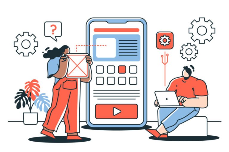
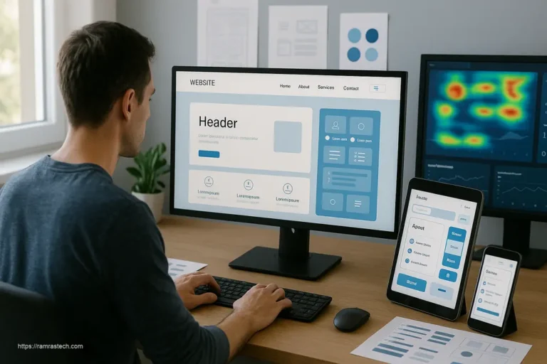
Ignoring User Testing: Assumptions vs. Reality
Another critical mistake is designing based solely on assumptions rather than actual user feedback. What seems obvious to you might be confusing to your users, and the only way to know for sure is to test.
Even simple usability testing with 5-7 participants can identify the majority of usability issues. Don’t wait until your site is completely finished to discover major problems – incorporate testing throughout your design process.
Sacrificing Usability for Aesthetics
Beautiful websites are great, but not if they’re difficult to use. I’ve seen too many sites with tiny, low-contrast text that looks “sleek” but is practically unreadable, or clever navigation that looks cool but confuses users.
Remember that the primary purpose of most websites is to help users accomplish goals – whether that’s finding information, making a purchase, or something else. Design should enhance this purpose, not hinder it. For more insights on balancing design with SEO, check out Maximizing Search Engine Rankings: A Guide to SEO-Friendly Web Design Services.
Implementing Web Design Principles in Your Projects
Starting with User Research
Before you design anything, understand who you’re designing for. User research doesn’t have to be complicated or expensive – it can be as simple as:
- Interviewing potential users about their needs and pain points
- Analyzing competitors’ websites to see what works and what doesn’t
- Creating user personas to keep your target audience in mind
- Mapping typical user journeys through your site
This foundation ensures your design decisions are rooted in real user needs rather than personal preferences or assumptions.
Creating Style Guides for Consistency
Style guides (sometimes called design systems) document your design decisions and help maintain consistency, especially for larger projects or teams. A basic style guide should include:
- Color palette with specific hex codes
- Typography specifications (fonts, sizes, line heights)
- Button and form styles
- Spacing standards
- Component patterns
Companies like Google (Material Design) and Apple (Human Interface Guidelines) publish comprehensive design systems that serve as excellent references for creating your own.
Testing and Iterating
Design is never truly “finished” – it’s an ongoing process of testing, learning, and improving. Build testing into your workflow:
- Use A/B testing to compare different design approaches
- Set up analytics to track user behavior
- Collect feedback directly from users
- Periodically audit your site against current design principles and best practices
Remember, even small improvements can have a significant impact on user experience and business outcomes.
Web Design Principles and Business Success
How Good Design Impacts Key Business Metrics
Well-implemented design principles don’t just make your site look good – they deliver measurable business benefits:
- Conversion rates: Effective hierarchy and clear calls-to-action can dramatically improve conversion rates
- Bounce rates: Intuitive navigation and fast loading times reduce bounce rates
- Average time on site: Engaging, well-organized content keeps users on your site longer
- Customer acquisition cost: Better user experience means more organic traffic and word-of-mouth referrals
- Customer lifetime value: Satisfying user experiences build loyalty and repeat business
A study by Forrester Research found that a well-designed user interface could raise a website’s conversion rate by up to 200%, while a better UX design could yield conversion rates up to 400% higher.
The ROI of Professional Web Design
Some businesses hesitate to invest in professional web design, seeing it as an expense rather than an investment. However, the data suggests otherwise:
- Bank of America saw a 45% increase in online banking registration after a redesign focused on simplicity and user needs
- ESPN.com increased their revenue by 35% after implementing responsive design
- Walmart saw a 2% increase in conversions for every second they improved in page load time
Professional design that properly implements web design principles pays for itself through improved performance across multiple business metrics. For more insights on maximizing ROI in your digital marketing efforts, check out How to Achieve Maximum ROI with PPC Advertising.
The Future of Web Design Principles
Emerging Trends Shaping Design Standards
While core design principles remain relatively stable, their application evolves with technology and user expectations. Some emerging trends to watch:
- Microinteractions: Small, subtle animations that provide feedback and delight users
- Voice user interfaces: Designing for conversation rather than visual interaction
- Augmented reality integration: Blending digital content with the physical world
- Dark mode by default: Reducing eye strain and battery consumption
- AI-personalized experiences: Adapting content and layout based on individual user behavior
These trends don’t replace traditional principles but add new dimensions to consider in your design process. If you’re interested in staying ahead of design trends, check out Revolutionary Web Design Trends Enhancing UX 2025.
Balancing Timeless Principles with Innovation
The most successful designers find ways to innovate while respecting proven principles. Think of principles as the foundation and innovation as the structure you build on top – without a solid foundation, even the most innovative design will collapse.
As you explore new techniques and technologies, always ask yourself:
- Does this enhance or detract from the core user experience?
- Does it serve the primary purpose of the website?
- Does it create barriers for any user groups?
Remember that not all innovation stands the test of time – remember splash pages and auto-playing music? True progress in design enhances usability rather than sacrificing it for novelty.
FAQs About Web Design Principles
What are the most important principles for e-commerce websites?
For e-commerce sites, the most critical principles are hierarchy, consistency, and performance. Your product must be the star, with clear pricing and call-to-action buttons positioned prominently. Navigation should be intuitive, allowing users to filter products easily. Site speed is particularly crucial for e-commerce—studies show that even a one-second delay can reduce conversions by up to 7%.
How do web design principles differ for B2B versus B2C websites?
B2B websites typically focus more on information architecture and content hierarchy, as these sites often need to communicate complex information to decision-makers. B2C sites generally place more emphasis on emotional appeal through color, imagery, and interactive elements. However, all fundamental principles apply to both—the difference lies in their relative priority and implementation approach.
Are there specific web design principles for mobile apps versus websites?
While the core principles remain the same, mobile apps have additional considerations like gesture-based interactions, limited screen real estate, and platform-specific guidelines (iOS versus Android). Mobile apps also often focus more on progressive disclosure—revealing information gradually to avoid overwhelming users on small screens.
How often should I redesign my website to keep up with changing principles?
Complete redesigns typically happen every 2-3 years, but you should continuously make smaller improvements based on user feedback and analytics. A better approach than periodic overhauls is evolutionary design—making regular, incremental changes that improve the user experience while maintaining familiarity for existing users.
How do I balance creativity with these principles?
Think of design principles as guidelines rather than rigid rules. They create a framework within which you can express creativity. The most innovative designs often come from understanding the principles so thoroughly that you know exactly when and how to bend them to create something fresh while still creating an intuitive user experience.
Conclusion
Web design principles aren’t just academic concepts—they’re practical tools that directly impact how users interact with your site and, ultimately, your business success. From the foundational elements like balance and hierarchy to emerging considerations like performance optimization and accessibility, these principles provide a framework for creating websites that not only look good but actually work for your users.
As you apply these principles to your own projects, remember that great web design is always in service to the user and business goals. The most beautiful website in the world is a failure if users can’t figure out how to use it or if it doesn’t support your business objectives.
The digital landscape will continue to evolve, but these core principles have stood the test of time because they’re rooted in how humans perceive and process information. Master them, and you’ll have the foundation to create effective websites regardless of changing trends or technologies.
What principles do you find most challenging to implement? Have you seen significant improvements after applying any particular principle to your website? I’d love to hear about your experiences in the comments!