5 Essential Website Design Principles for Higher Conversion
Have you ever landed on a website and immediately clicked away because something about it just felt… off? Maybe it was cluttered, slow to load, or you couldn’t find what you were looking for. That’s the power of website design principles at work – or in this case, the lack thereof.
In today’s digital landscape, your website is often the first impression potential customers have of your business. And let’s be real – that impression forms in milliseconds. Research shows that 75% of consumers judge a company’s credibility based solely on its website design, and a staggering 92.6% say visual elements directly influence their purchasing decisions.
But here’s the good news: understanding and implementing effective website design principles isn’t just about making things look pretty. It’s about strategically crafting an experience that guides visitors toward taking action – whether that’s making a purchase, signing up for a newsletter, or contacting your business.
In this post, we’ll dive into five essential website design principles that have been proven to enhance user experience and boost conversion rates. These aren’t just theoretical concepts – they’re practical guidelines backed by research and real-world results. So let’s get started on transforming your website into a conversion powerhouse!
Understanding Website Design Principles
Before we jump into the specific principles, let’s clarify what we mean by website design principles. These aren’t arbitrary rules made up to restrict creativity – they’re fundamental guidelines derived from years of research into how humans interact with digital interfaces.
Website design principles serve as the foundation for creating digital experiences that feel intuitive and satisfying while simultaneously achieving business objectives. They form the intersection where aesthetics meets functionality, where brand identity meets user expectations.
Think of these principles as the invisible architecture that determines whether visitors stay, engage, and convert – or bounce within seconds of arriving. When thoughtfully applied, these principles create a seamless experience where users naturally flow through your site toward conversion points without feeling manipulated or confused.
The beauty of these principles is that they work across industries and business types. Whether you’re running an e-commerce store, a SaaS platform, or a local business site, the same core principles apply – though how you implement them may vary based on your specific audience and goals.
Principle 1: User-Centric Design
The first and perhaps most crucial website design principle is placing users at the center of every design decision. This might sound obvious, but you’d be surprised how many websites are built around what the business wants to say rather than what users need to hear.
User-centric design starts with deeply understanding who your visitors are, what they’re trying to accomplish, and what barriers might stand in their way. This understanding should inform everything from your site’s information architecture to the placement of call-to-action buttons.
Why User-Centric Design Matters
When visitors land on your site, they typically have a specific goal in mind – finding information, purchasing a product, or contacting your business. If your design makes achieving that goal difficult or confusing, they’ll simply leave and find a competitor whose site better meets their needs.
Consider how Airbnb transformed their website by obsessively focusing on user needs. By simplifying their search process and creating intuitive navigation paths, they saw dramatic improvements in booking rates. They didn’t just guess what users wanted – they conducted extensive research, collected feedback, and continuously refined their approach based on actual user behavior.
Implementing User-Centric Design
Here are some practical ways to make your website more user-centric:
- Conduct user research: Use surveys, interviews, and analytics to understand who your users are and what they need.
- Create user personas: Develop detailed profiles of your typical users to keep their needs front of mind during the design process.
- Map the user journey: Chart the path users take from first arriving on your site to completing desired actions.
- Test with real users: Regularly conduct usability testing to identify pain points and areas for improvement.
By designing with users in mind, you create an experience that feels effortless and intuitive – one that naturally guides visitors toward conversion without friction or confusion.
Principle 2: Simplicity and Clarity
In the world of website design, less is almost always more. Simplicity isn’t about being minimalist for aesthetic reasons – it’s about reducing cognitive load so visitors can focus on what matters.
The psychological principle behind this is called Hick’s Law, which states that the time it takes to make a decision increases with the number and complexity of choices. In practical terms, this means that the more options, elements, and information you present to users, the slower and more difficult decision-making becomes – directly impacting your conversion rates.
The Power of Simplicity
A compelling example comes from Unbounce, which found that simplifying a landing page by removing unnecessary form fields increased conversions by 120%. Similarly, when one major retailer reduced the number of products displayed on their category pages from 20 to 12, they saw a 24% increase in sales.
Simplicity works because it creates focus. When visitors aren’t distracted by unnecessary elements, they can more easily process your value proposition and follow the path to conversion.
Implementing Simplicity and Clarity
Here are some practical ways to simplify your website design:
- Embrace white space: Give content room to breathe rather than cramming elements together.
- Limit options: Reduce the number of menu items, form fields, and calls-to-action.
- Create clear visual hierarchy: Use size, color, and positioning to guide attention to the most important elements.
- Write concise, scannable content: Break text into short paragraphs with descriptive headings.
- Eliminate unnecessary elements: Ask of every component: “Does this help users accomplish their goals?”
The e-commerce giant Amazon, despite selling millions of products, maintains simplicity in their product pages through clear organization, concise descriptions, and prominent call-to-action buttons. This clarity helps guide users through what could otherwise be an overwhelming experience.
Remember, simplicity doesn’t mean lacking sophistication or depth. It means presenting information in a way that feels effortless for users to process and act upon.
Principle 3: Consistency in Design
Consistency might not sound like the most exciting design principle, but it’s absolutely crucial for creating websites that convert. When elements like navigation, buttons, colors, and terminology remain consistent across your site, users can focus on their goals rather than figuring out how things work on each new page.
Consistency builds trust and reduces cognitive load by creating predictable patterns. When users know where to find navigation elements and how interactive components will behave, they develop confidence in your site – and by extension, your brand.
The Impact of Consistency
Research from the Nielsen Norman Group shows that users form mental models of how websites work, and inconsistencies force them to develop new models – creating friction and frustration. This directly impacts conversion rates, as each moment of confusion is an opportunity for users to abandon your site.
A real-world example comes from a study by KWSM Digital, which found that maintaining consistent messaging between advertisements and landing pages increased conversion rates by up to 115%. When users click on an ad promising specific benefits, the landing page must deliver on those expectations with consistent language and design.
Types of Consistency to Maintain
There are several dimensions of consistency to consider:
- Visual consistency: Use consistent colors, typography, button styles, and imagery across your site.
- Functional consistency: Ensure interactive elements like buttons and forms work the same way throughout the user journey.
- Content consistency: Maintain a consistent tone of voice, terminology, and messaging hierarchy.
- External consistency: Align your website experience with user expectations based on similar sites in your industry.
Implementing Consistency
Here are practical ways to build consistency into your website design:
- Create a design system: Develop a library of reusable components, patterns, and guidelines.
- Use templates: Create page templates that follow consistent layouts while allowing for content variation.
- Develop style guides: Document standards for typography, color usage, spacing, and other visual elements.
- Audit regularly: Periodically review your site for inconsistencies that may have crept in during updates.
HubSpot provides an excellent example of consistency in action. Their site maintains consistent navigation, button styles, and visual language across hundreds of pages, creating a cohesive experience that feels trustworthy and professional.
Remember that consistency doesn’t mean being boring or identical across every page. It means creating a unified system with enough flexibility to accommodate different content needs while still feeling part of the same family.
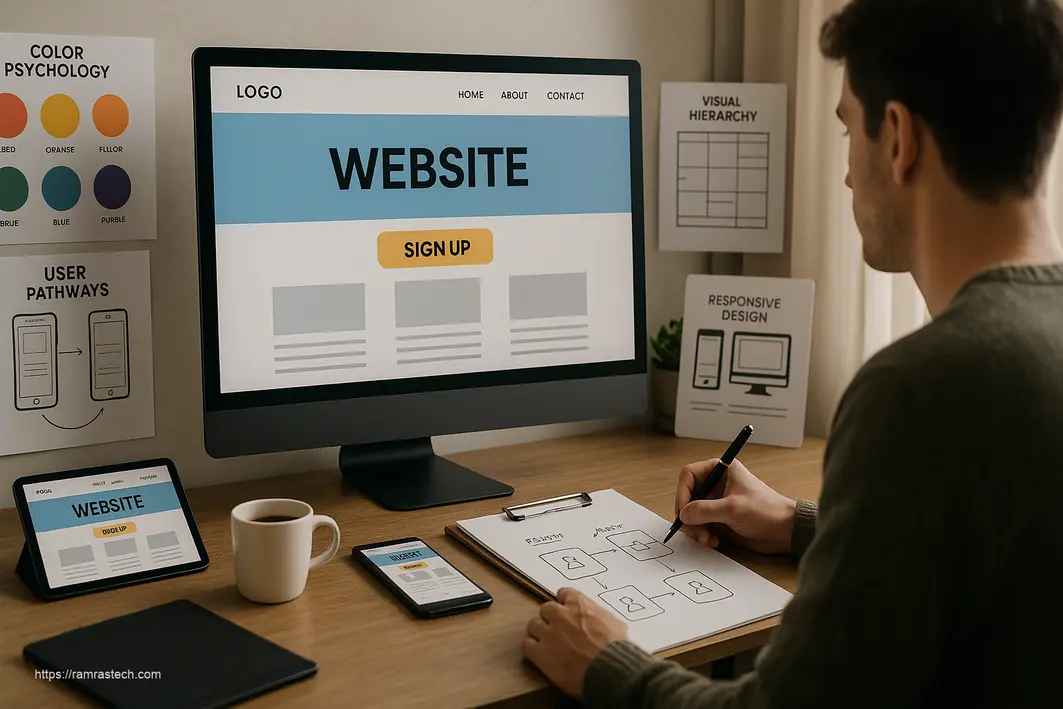
Principle 4: Effective Use of Color and Typography
Color and typography might seem like purely aesthetic concerns, but they’re actually powerful tools for driving conversions. The strategic use of color and fonts shapes first impressions, guides attention, evokes emotions, and reinforces brand identity – all of which impact whether visitors take desired actions.
The Psychology of Color
Colors evoke specific psychological responses and can significantly influence user behavior. For instance:
- Red: Creates urgency and excitement, often used for clearance sales or limited-time offers
- Blue: Evokes trust and security, commonly used by financial institutions and healthcare providers
- Green: Associated with growth and positive action, frequently used for “proceed” or “buy” buttons
- Orange: Conveys enthusiasm and affordability, popular for calls-to-action
A study by ConvertizeX found that changing a call-to-action button from green to red increased conversions by 21% on one site – though the optimal color will depend on your specific audience and how the button contrasts with surrounding elements.
Typography That Converts
Typography choices affect not just readability but also how users perceive your brand and messaging. Consider these factors:
- Readability: Fonts should be easily readable at various screen sizes
- Personality: Typography conveys subtle messages about your brand (professional, friendly, luxurious, etc.)
- Hierarchy: Different font weights and sizes help users understand what’s most important
- Contrast: Sufficient contrast between text and background improves both readability and accessibility
Implementing Effective Color and Typography
Here are some practical guidelines for using color and typography to boost conversions:
- Limit your color palette: Use 2-3 primary colors plus 2-3 accent colors to create a cohesive look without overwhelming users.
- Create meaningful contrast: Ensure your call-to-action buttons stand out visually from surrounding elements.
- Consider color psychology: Choose colors that align with your brand personality and the emotional response you want to evoke.
- Use typography to create hierarchy: Guide users through content with clear heading structures and comfortable body text.
- Ensure accessibility: Maintain WCAG-recommended contrast ratios (at least 4.5:1 for normal text) to make your site usable for everyone.
- Test different options: A/B test color and typography choices to see what resonates best with your specific audience.
Mailchimp offers an excellent example of effective color and typography use. Their distinctive combination of playful illustrations, a focused color palette centered around their signature yellow, and clear typography creates a memorable yet highly usable interface that has helped them achieve impressive conversion rates.
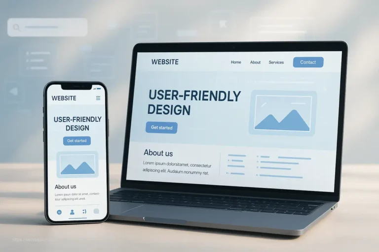
Principle 5: Mobile Responsiveness
If your website isn’t optimized for mobile devices in 2025, you’re essentially turning away a massive portion of potential customers. With mobile traffic accounting for approximately 60% of all web traffic globally, mobile responsiveness isn’t just a nice-to-have feature – it’s an essential website design principle for conversions.
Mobile responsiveness means your website automatically adapts to provide an optimal experience across all devices and screen sizes – from desktop monitors to tablets and smartphones. This goes beyond simply shrinking your desktop site to fit smaller screens; it requires thoughtfully reconsidering layout, navigation, and interaction patterns.
Why Mobile Responsiveness Matters for Conversions
The connection between mobile optimization and conversion rates is well-established:
- Google research found that 61% of users are unlikely to return to a mobile site they had trouble accessing, and 40% visit a competitor’s site instead.
- According to Statista, mobile commerce (m-commerce) is projected to account for 72.9% of all e-commerce sales by 2025.
- A study by VWO found that optimized mobile experiences can increase conversion rates by up to 64%.
Put simply, if users can’t easily navigate, read content, or complete actions on their mobile devices, they won’t convert – they’ll leave.
Key Elements of Mobile Responsiveness
True mobile responsiveness encompasses several critical factors:
- Fluid layouts: Content that automatically adjusts to different screen dimensions
- Touch-friendly navigation: Larger tap targets (at least 44×44 pixels) and intuitive gesture support
- Optimized media: Images and videos that load quickly and display properly on mobile connections
- Streamlined content: Prioritizing essential information for smaller screens
- Fast loading times: Pages that load in under 3 seconds (Google’s recommended threshold)
- Accessible forms: Input fields and buttons sized appropriately for fingertip interaction
Implementing Mobile Responsiveness
Here are practical strategies for improving mobile responsiveness:
- Adopt a mobile-first approach: Design for mobile devices first, then enhance for larger screens.
- Use responsive frameworks: Leverage frameworks like Bootstrap or Foundation that have mobile responsiveness built in.
- Test on real devices: Don’t rely solely on browser emulators – test your site on actual smartphones and tablets.
- Optimize images: Compress images and implement responsive loading techniques to improve mobile performance.
- Simplify navigation: Consider hamburger menus or other compressed navigation patterns for mobile views.
- Minimize text entry: Reduce form fields and implement helpful features like address auto-complete.
Starbucks provides an excellent example of mobile responsiveness done right. Their website seamlessly adapts across devices while maintaining brand consistency, and their mobile ordering flow is streamlined to reduce friction – resulting in millions of mobile transactions.
Google’s PageSpeed Insights and Mobile-Friendly Test are valuable tools for assessing and improving your site’s mobile responsiveness. Regular testing across different devices should be part of your ongoing website maintenance strategy.
Putting It All Together: The Conversion-Driven Website
We’ve explored five essential website design principles individually, but the real power comes from integrating them into a cohesive approach. When user-centric design, simplicity, consistency, strategic use of color and typography, and mobile responsiveness work together, they create a conversion ecosystem greater than the sum of its parts.
The most effective websites don’t just implement these principles in isolation – they weave them together to create seamless experiences where each element reinforces the others. For example:
- A user-centric approach identifies what visitors need, allowing you to simplify the interface to focus on those key elements.
- Consistency in design makes your site intuitive to navigate, while thoughtful color and typography help guide users toward conversion points.
- Mobile responsiveness ensures these principles work effectively across all devices, meeting users where they are.
Measuring Success
Implementing these website design principles isn’t a one-time project but an ongoing process of refinement. To gauge effectiveness, track key metrics including:
- Conversion rate: The percentage of visitors who complete desired actions
- Bounce rate: The percentage who leave after viewing only one page
- Average session duration: How long visitors typically spend on your site
- Pages per session: How many pages visitors view during each visit
- User flow: The paths visitors take through your site
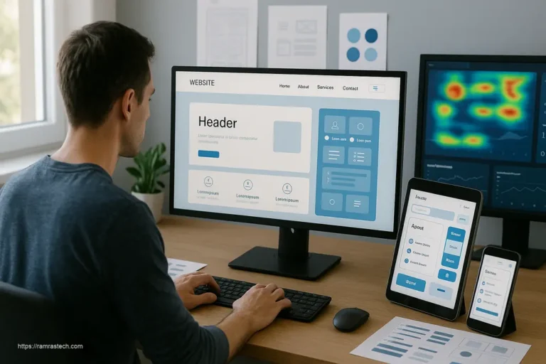
- Heat maps: Visual representations of where users click, move, and pause
Tools like Google Analytics, Hotjar, and Crazy Egg can help you gather these insights. Use this data to identify areas for improvement and prioritize updates that will have the greatest impact on conversions.
Common Mistakes to Avoid
Even with the best intentions, websites often fall short of their conversion potential due to common design mistakes:
- Prioritizing aesthetics over usability: Beautiful but confusing sites rarely convert well
- Ignoring user research: Making assumptions about what users want instead of asking them
- Cluttered layouts: Trying to fit too much on a single page
- Inconsistent navigation: Changing how menus work across different sections
- Slow loading times: Failing to optimize images and code for performance
- Hidden contact information: Making it difficult for users to reach you
- Confusing call-to-action: Unclear or competing directions about what users should do next
Regularly audit your site for these issues and prioritize fixes based on their potential impact on your conversion funnel.
Conclusion
Effective website design principles are not just about creating visually appealing sites – they’re about strategically crafting experiences that guide visitors toward taking meaningful action. By implementing user-centric design, embracing simplicity and clarity, maintaining consistency, using color and typography strategically, and ensuring mobile responsiveness, you create a foundation for higher conversion rates across all industries and business types.
Remember that implementing these principles is an ongoing journey rather than a destination. User expectations evolve, technologies advance, and business goals shift – requiring continuous refinement of your website experience.
The most successful websites are those that balance business objectives with user needs, creating experiences that feel helpful rather than manipulative. When visitors feel understood and supported in achieving their goals, conversions follow naturally.
Now it’s time to evaluate your own website against these principles. Which aspects are you executing well, and where might there be opportunities for improvement? Small, strategic changes guided by these fundamental website design principles can lead to significant improvements in your conversion rates and business outcomes.
FAQs About Website Design Principles
How do website design principles directly impact conversion rates?
Website design principles impact conversion rates by reducing friction in the user journey. Good design creates clear paths to action, builds trust through consistency, reduces cognitive load through simplicity, guides attention with strategic color and typography, and ensures accessibility across devices. Studies show that implementing these principles can improve conversion rates by 50-200% depending on the starting point.
What’s the most important website design principle for e-commerce sites specifically?
For e-commerce sites, simplicity and clarity often yield the biggest conversion improvements. Streamlining the product discovery and checkout process directly impacts sales. This includes clear product photography, concise descriptions, prominently displayed prices, simple navigation filtering, and a checkout process with minimal steps. Amazon’s one-click ordering feature exemplifies this principle taken to its logical conclusion.
How often should I update my website design to maintain conversion rates?
Rather than complete redesigns at set intervals, adopt a continuous improvement approach based on data. Conduct minor updates quarterly based on user feedback and analytics, with more substantial revisions every 1-2 years to address evolving user expectations and technologies. Always A/B test significant changes to ensure they positively impact conversion metrics before full implementation.
Do these website design principles apply equally to B2B and B2C websites?
The core principles apply to both B2B and B2C sites, but their implementation differs based on audience needs. B2B sites typically need more detailed information, longer content, and emphasis on credibility signals like case studies and testimonials. B2C sites often benefit from more emotional appeals, simpler messaging, and friction-free checkout processes. In both cases, understanding your specific audience’s goals is essential for optimizing conversions.